Commercial property
Apollo
- Project via Virtualoom
- Apollo Business Park
- Services
- Brand identity, brochure design
- Year
- 2025
The brief
Apollo Business Park takes its name from the Greek god of light, giving the identity a natural starting point without needing to illustrate the reference literally.
The challenge was to create something distinctive enough to give the development its own character, while remaining clear and credible within commercial property marketing.
Outcome
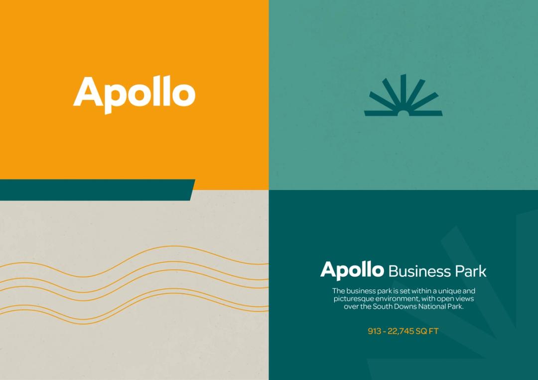
A sun-like symbol is constructed from repeating letterforms, bringing the Apollo reference into the identity through geometry rather than illustration. Angular forms extend from the mark into a broader graphic language used throughout the brand.
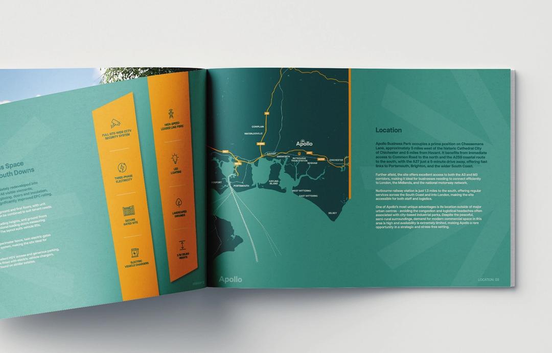
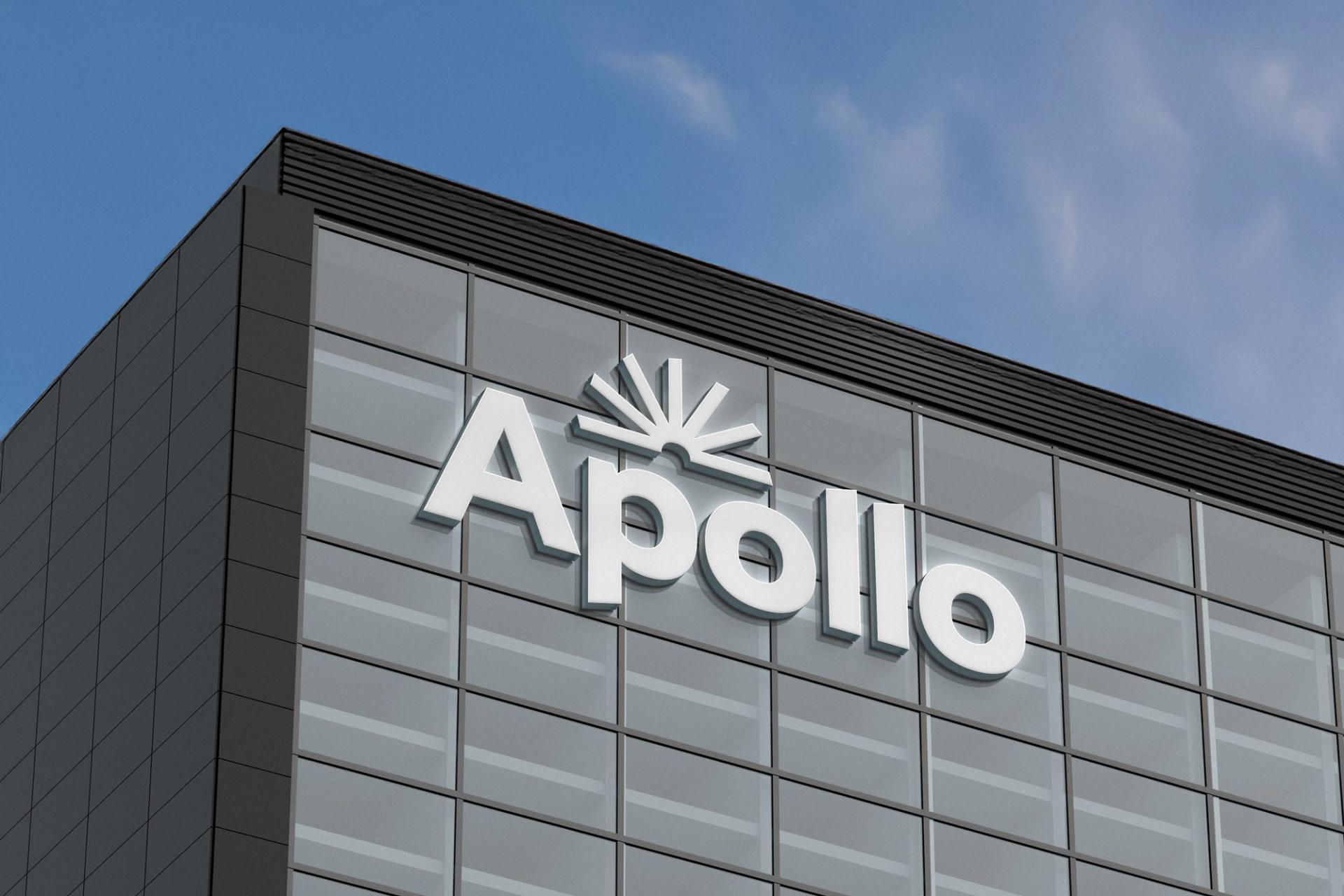
A warm, natural palette connects the identity to its South Downs setting, while the system carries across building graphics and the leasing brochure to create a consistent sense of place.